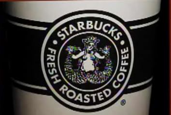
Starbucks reverting to their retro look.
Starbucks decided that they would go back to their retro roots with their logo. Unfortunately not many people agrees with this. I'm not so much of a "design and looks" guy, so I don't really care if they ever decide to put a fat guy on their logo just as long as they keep their excellent coffee taste.
But you can't please everyone. A Christian group based in San Diego called "The Resistance" dislikes this new design. The group says "...Has a naked woman on it with her legs spread like a prostitute....The company might as well call themselves Slutbucks". They are also calling out for a national boycott on SB. Yes I shortened that.
Honestly? I laughed when I heard their statement. Give them a break its just a design. Blerghhhh.
P/S I have nothing against fat people. I think you guys are cool. Just cut down on the fried stuff yeah?
Like what I wrote in this article? Subscribe to my full RSS :)
5 comments:
i actually thinks "slutbucks" suits the new design. u gotta match ur concept and theme with ur brand.
haha, yeah probably. im sure majority of the people around dont really care what the new logo looks like. just those activist!
ive never really noticed the old logo, and the new logo looks like a mermaid having her tail cut in two..
lol
stoopid starbucks. i only go there if i dont have any other choice!
OMG as an ex-starbucks-er .. the logo is actually a Siren. a mermaid with 2 fins.. dumb also people ingat it's her legs spread. tsk tsk
yeah it is zoozoo. but some people extreme i guess.
Post a Comment